How to Choose a Color Palette Using an Inspiration Piece
Color Me Inspired!
While scrolling through my Instagram feed recently, I came upon this painting by Rachel Ruysch that is being auctioned off at Sotheby’s. (You know, that fancy auction house for rich folks?) The estimated worth is 1-1.5 million dollars. So, pardon me while I just go get my checkbook…
I’m just kidding. Who uses checks anymore?
I stared at this painting for quite a while. Something about it just spoke to me. It said, “I can help you teach your readers how to choose a color palette using an inspiration piece…” And I thought, Hmm. A talking painting… Well, that’s terrifying. But, hey, great idea, painting.
So, here we are.
What Inspires You?
Inspiration can come from anywhere. A painting, wallpaper, a fabric, a rug, or even your favorite foods.

OK. Well, maybe not Froot Loops… But this healthy breakfast looks pretty.
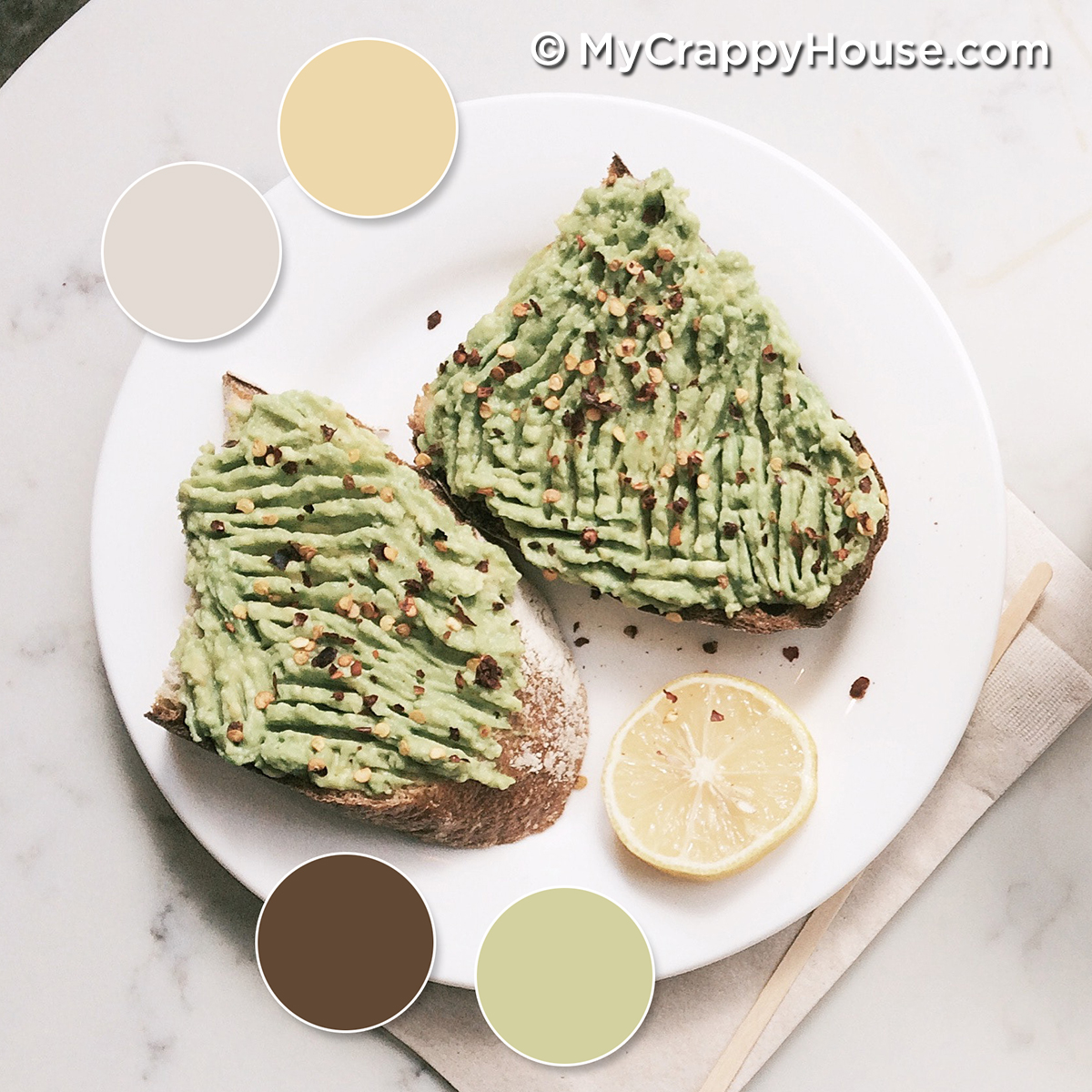
The idea is that, if your eye is pleased by the color arrangement in your inspiration piece, then you will love a room based upon it.
I find inspiration everywhere. For my living room and dining room, I found it in a bird.

In fact, I wrote this post all about it. I even shared a trick with you for creating a color palette from your own inspiration piece, so this isn’t new territory, per se, but I found a new, fun tool for creating color palettes that I wanted to share with you, which is new territory.
So, let’s dive in using this pretty (expensive) painting as our inspiration. So many dollars colors!
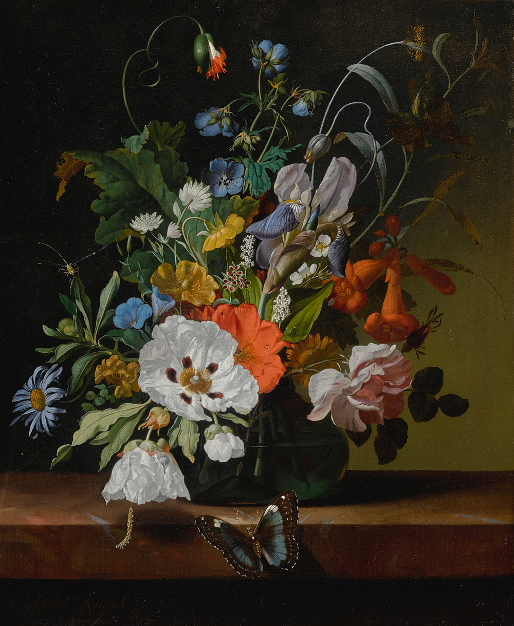
In that other post I wrote (the one I just linked above for you that you didn’t click on), I recommended Big Huge Labs, a website that will automatically create a color palette for you from a photo. It does a great job, but how do you translate those digital colors on your screen into the real world? Sherwin Williams has created a free app called ColorSnap that solves this problem.
How to Choose a Color Palette Using ColorSnap

Like Big Huge Labs, ColorSnap will also generate a color palette from an inspiration photo. The difference with this new app is these colors correspond to actual paint formulas in real life. How cool is that? (This post is not sponsored by Sherwin Williams. I just really like this app.)
To begin, launch the app and scroll down to “Match a Photo”:

Then choose a photo from your phone’s gallery (or, take one of your inspiration piece.) I uploaded our inspiration painting and was presented with this handful of colors chosen for me, right out of the image.

Neat, right? If you don’t like one of the colors (Seriously, what’s up with that red?), just tap the offensive color at the bottom and a little trashcan icon will pop up. Then you can just tap it to throw that jerk color away.

That red is called Stop. How apropos.
To change a color, just touch on any of the swatch circles that you don’t particularly like and drag it around your image. You’ll be able to see color samples in real time. Just stop when you like what you see and the app will add that color to your palette. I made you this little video to demonstrate…

If you turn your phone sideways, you’ll get this nifty chart showing you exactly where you can find your swatches in a Sherwin Williams store display. The app pretty much does everything for you but pick you up and drive you there. What a time to be alive.

Time to Pick Up a Few Twenty Paint Samples.
OK, but what if you don’t like Sherwin Williams paint? I actually love their paint, but you’re entitled to your wrong opinion. Most paint stores will mix colors from other manufacturers with pretty decent results. You can get them to mix you a sample if you’re nervous. Actually, I’m a big fan of samples.
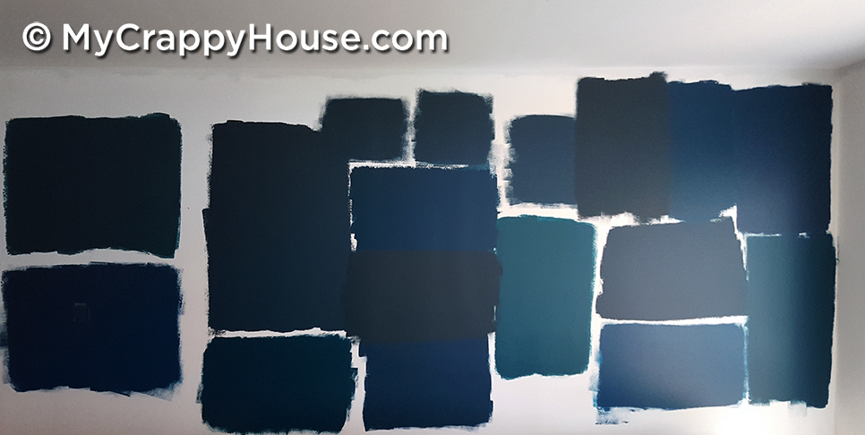
I wasn’t even nervous. Just crazy.
If you don’t love a particular color in person, at least now you have a starting point to compare other shades and find one that you do like. (It’s OK to be discerning. Picky people always have high IQs. This is a scientific fact that I made up.) And, remember, those colors aren’t just for paints. Keep those swatches handy when you shop for furniture and décor.
A Room Based on a Masterpiece
So, that’s my fool proof method for how to choose a color palette using an inspiration piece. Are you wondering what an actual room would look like using our example? I thought so. Check out this mood board that I made, illustrating just one possibility…
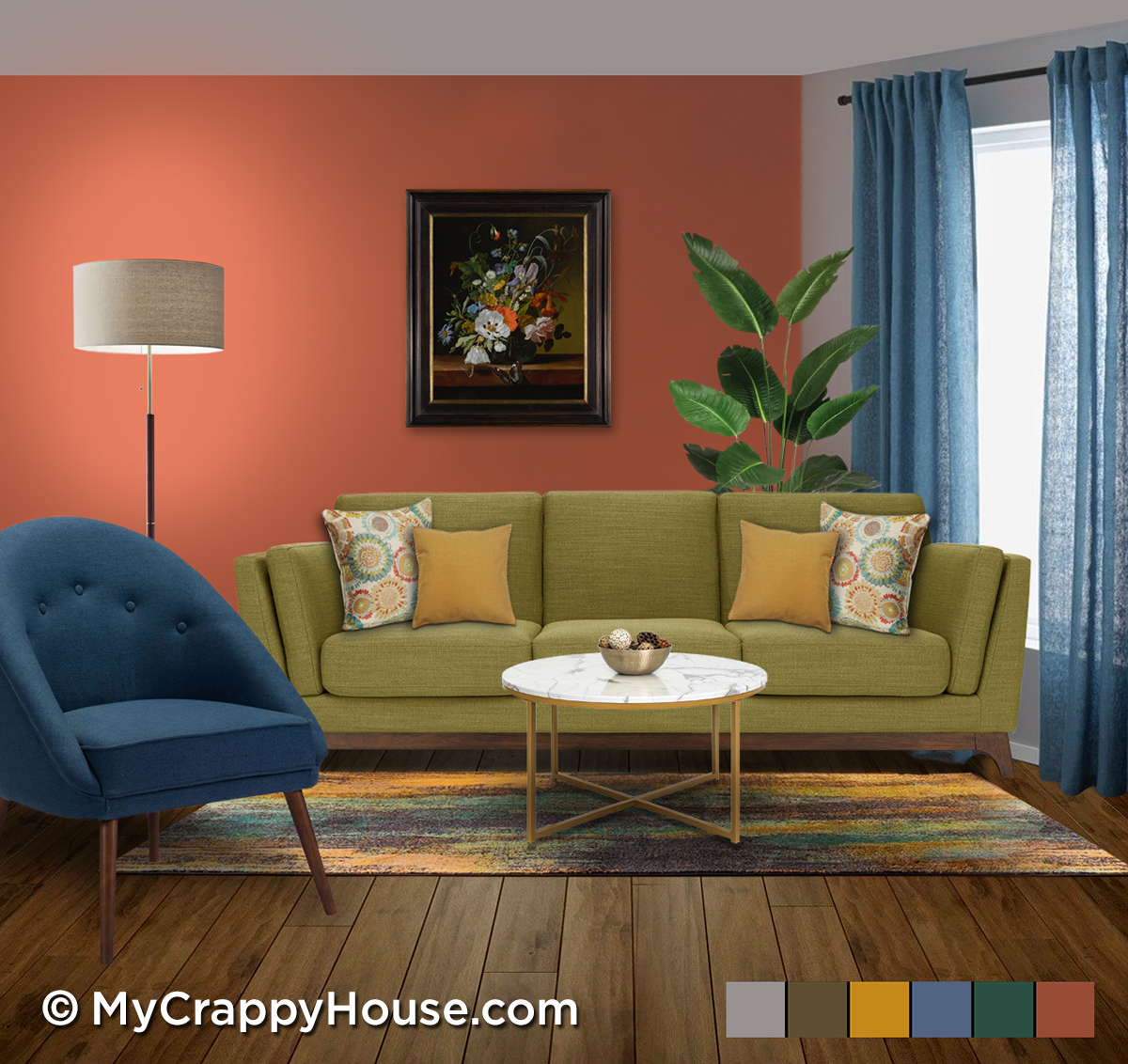
Sofa | Chair | Rug | Lamp | Table | Curtains | Patterned Pillow | Solid Pillow
How’s that for a cohesive color palette? Who knew those colors would play so well with each other? After all, they’re so diverse. That’s why the inspiration piece is so helpful. It’s not their first time hanging out together. These colors have been friends since 1698 when a nice lady named Rachel introduced them to each other in her lovely painting.
One of these days, I will write a post about mood boards. Like, wtf they are, why they’re a good idea, and how you can create one yourself. You should probably subscribe below so you don’t miss that.
***At the time of publishing, the Rachel Ruysch masterpiece featured in this post was auctioned for 2.2 million dollars. Alas, I did not buy it.
*This post contains affiliate links.




8 Comments
Joy O'Shaughnessy
That room is awesome!
Too bad that painting will likely be crated up and stored in a warehouse as an investment instead of being on a wall in a room this lovely.
My Crappy House
Aww, thank you! Hopefully, the painting was purchased by a collector or a museum so it won’t be hidden away. It’s sad to think of how much beauty is probably locked away in warehouses
Jill Hand
You’re so funny and smart! I love your sense of humor and your commitment to transforming your crappy house into a lovely house.
Would you consider allowing me to interview you for my website? I’d love to have you as a guest.
Best regards
Jill Hand
My Crappy House
Why, thank you. Sure, I love interviews. Send me an email via the contact tab above and we’ll chat about it.
Katherine Davies
It’s funny, because I am wrestling with this right now. And oddly enough, the room in question currently has all the colors in that painting! Wow! But it’s too many for me, so I don’t know what to do! Sheesh! But I’ll go have a very careful look at your instructions now. Can’t get Sherwin Williams here in France, but I think you’ve otherwise helped me a lot…..if I can get the apps to work. Thank you!
My Crappy House
Well, that’s a coincidence! I did keep quite a few colors in my palette, but you definitely don’t have to. If you keep your palette small, I’d suggest you have one or two neutrals and one or two unexpected, fun colors. This will keep your room from looking like a circus, yet it’ll still be interesting. Remember, you can always use the Big Huge Labs website if the ColorSnap app doesn’t work for you. Either way, you’ll have to match what you see on the screen to colors in the real world, but it’s totally doable. Just bring a screenshot of your palette to the paint store and use your best judgment when matching the colors. It’s not an exact science, but at least it’s a starting point. Good luck!
Em
This looks like it could border on a being a recreational activity for me. I’ve used Colorsnap many times to virtually recolor something in one of my rooms…like a pillow or dresser etc. But this opens of a whole new realm of fun possibilities!
Also, I am terrible with color, so I love that it could help me choose! Thanks!
My Crappy House
I tried the other features of ColorSnap and I wasn’t too impressed. The palette generator is where it’s at. It’s definitely very game-like. More useful than Lily’s Garden though. (My current phone game that I waste all of my time with…)